
Coloring an animation
Where trees can be red and pink and blue

Log
Project | SONHOS
Time in production | 49 weeks and 1 day
Status | Clean up, Coloring, Backgrounds
Guess what, something completely predictable happened - after turning in the project, I fell into “relax mode” and progress is slow. But not stopped! I’m taking this time to rest a bit and recharge energy to continue strongly. Let’s talk about colorful things now!
The Color Script
I love color, and therefore love doing a color script. I have done those for unfinished projects before, but finally had the change to apply one in SONHOS.
What is a color script? The same way a written script dictates what will be said and seen in the film, the color script dictates the colors present in each scene. Since movies are aesthetically controlled, the same way you pick a specific costume, you pick a specific color for the trees. Animation, I believe, has more freedom in that area than live action.
How that literally looks like is a big sheet with smaller images, each image being one representative frame of a scene.
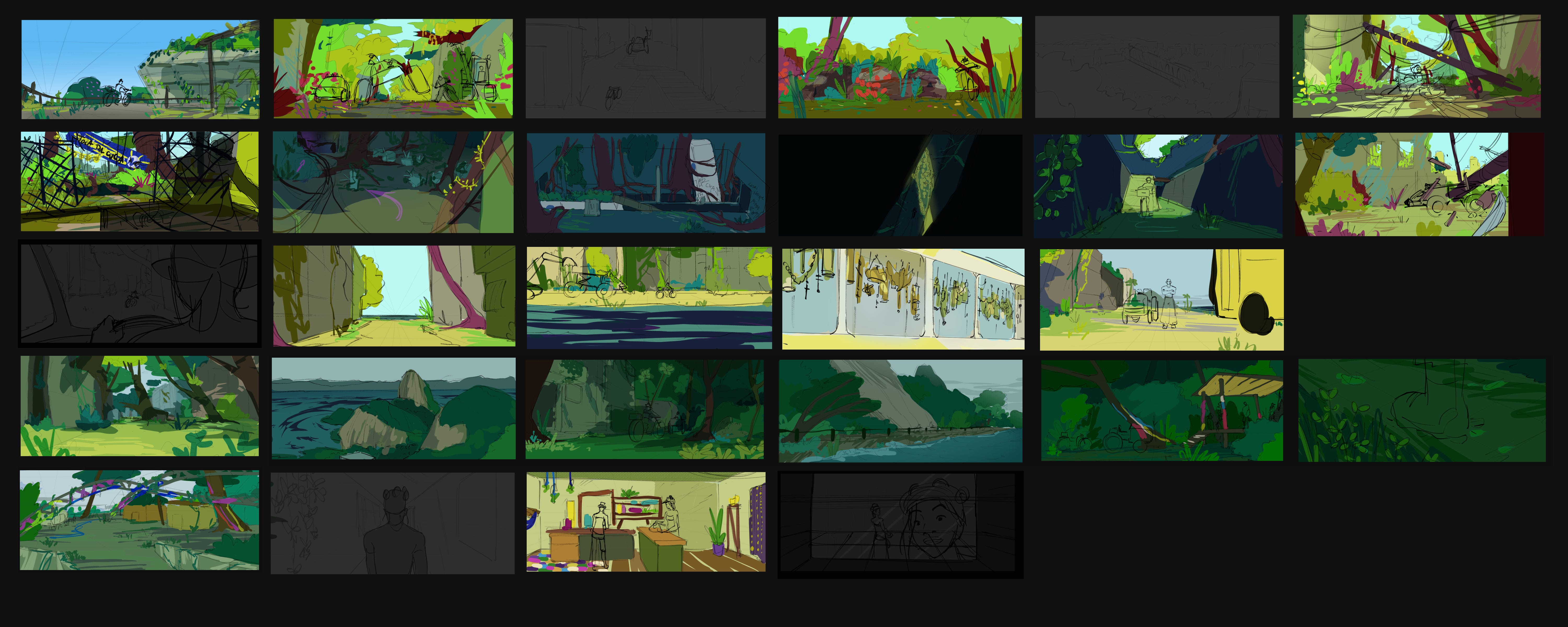

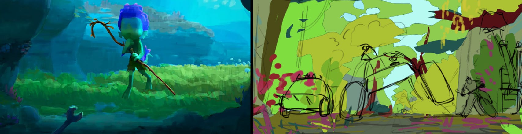
In my case, like with all the other steps, I simplified it. Professional feature films have a lot more frames, to show color shifts within a same scene, but I just wanted a very rough progression of the overall palette. I also work with rougher strokes - proper color scripts are little, even if sketchy, paintings, being quite readable. Mine are really just color blobs placed above the sketch of the scene. Here is a video by Pixar about their process for the film Luca.
Since the animation style chosen for SONHOS does not involve light and shadows, the color choices were made in regards to the local colors of the objects. That’s why I decided to be very free in what colors the environment has.
The Choices
The short starts with naturalistic colors, even if extra vibrant (high saturation), to show how sunny and bright it is. I want it to start more natural to create a build up into the world of the short, with a subtle reveal - first we think, it’s just the city, then we notice it’s destroyed and overgrown.
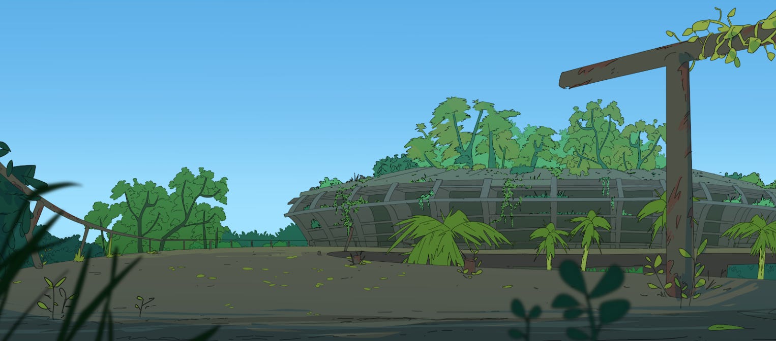
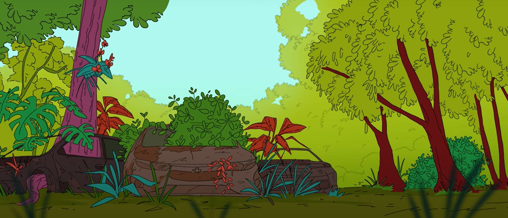
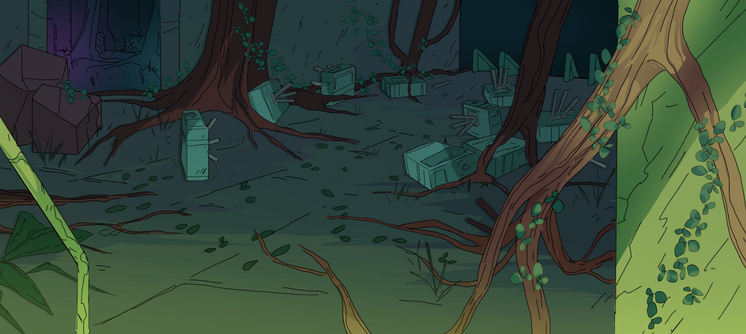
Overgrowth - there is a lot of green. The first scene has more blue- greens or green-greens. But in the following sequence, where danger appears and the protagonist gets pursuit, the greens become yellower and unnaturally saturated.
The dangerous parts have the most distorted colors, to emphasize the tension. That was done using unusual colors for the vegetation - like reds, pinks, neon green - and high saturation. Yellow is a high-intensity color so the whole palette shifted towards yellows, and red was included as the classic signalizer of “danger”. However, even in this distortion I tried to always keep in mind “How does Rio feel? Do those colors feel like a warm day in Rio specifically?” Afterall, the Rio-ness of the environment is a main aspect of the whole project.
When Tapioca briefly finds refuge in the subway, everything becomes very dark and blue. The greens become dark blue-greens, with some brighter tones for pop, and purples are used in the shadows to create a feeling of mystery. What’s down there? Is it dangerous or safe? It’s also flooded and swampy almost, so the blues bring that association to wet-ness and humidity.
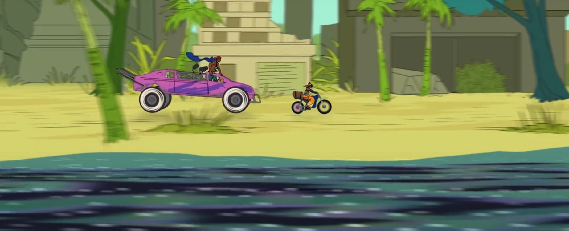
Then, when the pursuit continues, the yellows come back - but turning into the beach, the iconic Copacabana beach, the yellows are complemented with green-blues from the ocean. The ocean is greener than bluer to not loose the sense of tension and distortion, this is not a calm ocean but part of the danger. The oil spills are purple-ish to have a strong contrast in the greenish water, making it feel like it doesn’t belong in this landscape.
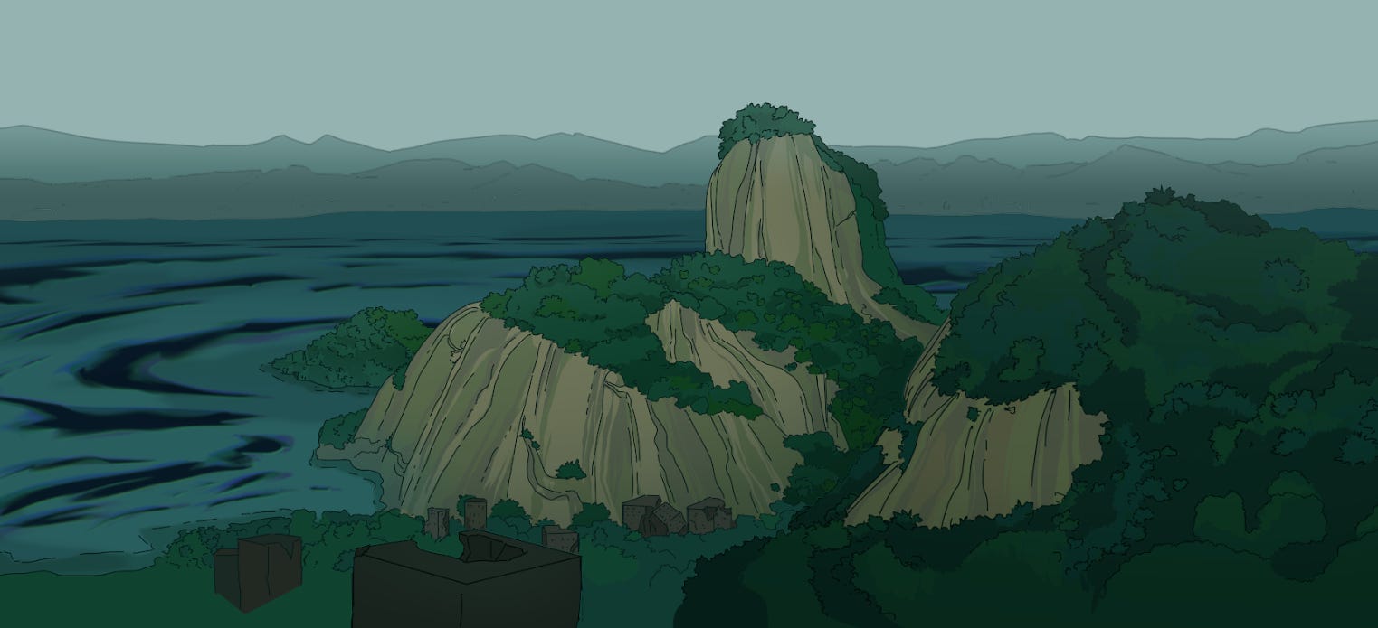
When the danger is over, and Tapioca accompanies Técnico Dedê to their safe spot, the colors go back to more naturalistic, but this time very desaturated and grey. This moment is overcast, not sunny. Why is it overcast, if it’s supposed to be the “danger is gone so everything is fine” moment? Classically, movies communicaty happiness and tranquility with the sun, but I personally find sunny days to be uncomfortable and heavy. I love overcast days. They are cozy and calm. I don’t associate negative feelings to grey days and rain, so I made a point of incorporating this personal association into the film. This fits especially into a world in which the climate collapse made day time be oppressingly hot.
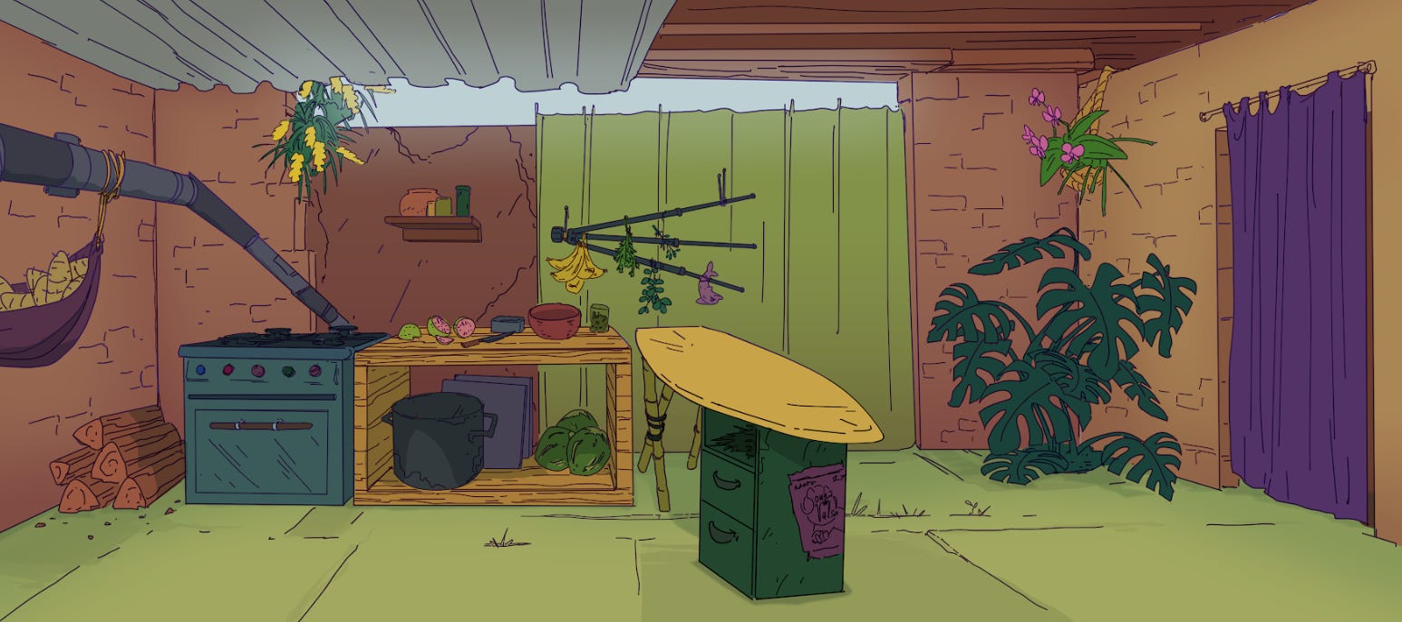
We return to brighter and more vivid colors in Kellen’s Kitchen, since the character is supposed to be bright, happy, optimistic and playful. The kitchen uses warm earth tones, greens, yellow and purple, in a somewhat complementary color scheme (that is also the palette of the character design), but in a slightly chaotic way, because the aesthetic of the project is still a chaotic-post-apocalypse where nothing is super neat and cohesive.
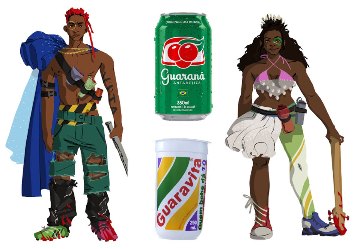
The characters
The characters have colors! However, the process of defining the colors for the character designs was a lot more intuitive. I went with what felt right - always coming back to the Feeling Like Rio thing. The result is Tapioca being predominant in orange, with blue and purple as complementary colors, and making her always pop off the backgrounds, as I avoided using oranges in the environment. Kellen is green and purple/pink, with the latter bringing a bit of the playful element. (Very saturated) purples and pinks are not very common in the natural world, so it can lead to associations related to plastic and other artifical objects, which in turn make me think of toys. And Kellen likes toys. Dedê has a more sober palette, to communicate his leadeship and seriousness, but with the colorful dots that bring the clown-element into the design, which is the initial inspiration for his group (street jugglers).
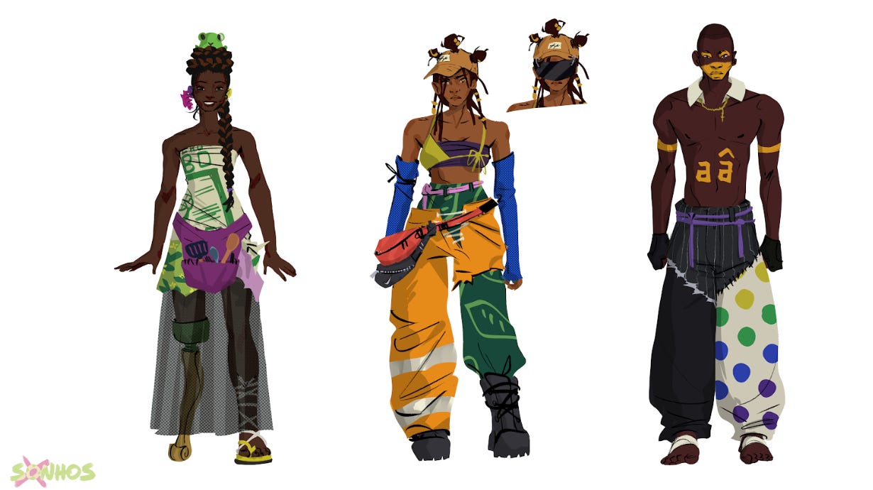
The Caolheirox all have some element in their design that relates to Guaraná beverages. Theus has the classic red-green Antartica color scheme, while Maré keeps it more subtle with the boots, but featuring the eye-imagery more heavily. Some secondary characters, not featured yet, have designs that relate to other Guaraná brands than Antartica.
Actually coloring
This is very obvious, but I just had to color in line work for this style, no rendering. The character colors are all done in one layer, with a clipping layer on top for patterns. For the environment, the colors are separated along with the line art in the layers that they will be exported as - foreground elements, middle ground, background, etc.
I love this topic, so feel free to ask more about it!
Colors are something that tourists often comment about Brazil, so I wanted to really put care into this process. And it seems to have worked, as the trailer I have shown people made many of them comment on the colors specifically! Such successes are very fulfilling.
Up Next
I believe we got to a point where I talked about most of the art-creation parts. Next issue I will talk about time - how long each part takes, how the project fit into my routine, delays and misjudgements. Let me know if there is something else you need to know about!
Have a magical day!