


The Concept Art Begins
Picking a style, first character sketches, and...cars

Log
Project SONHOS
Time in production 21 weeks 4 days
Status Summer break
Style
Unrelated to the short film project, I have been wanting to study the style Alberto Mielgo uses in his recent character art (Spiderverse, The Witness), so instead of doing a random study drawing I decided to do the character designs for SONHOS in a style inspired by his. Not only did this give me the opportunity to apply whatever I learned from the style, but it also communicates the boldness of the project itself.
Because the style is bold. It uses bold colors and a line art style that looks like literally bold sharpie sketches. That does not only look cool, but turns out to be pretty efficient and fast. From my superficial analysis, he starts with flat color shapes for the elements of the character, adds symbolic texture where needed, and then finishes the details with rough, quick line work on top, and a simple multiply layer for shadows, which create volume where needed. The linework is not clean or detailed, it doesn’t define every crease of the clothing, but is absolutely minimal to what is needed to understand the drawing. And that is fast. It encourages me to leave many areas simply flat color shapes, which makes the design in general quite confident.

A bigger difference between his concept art and mine is the level of render in the faces and textures. His projects work with 3D, so a specific likeness to the faces matter, while my project will be executed in 2D. The same logic applies to the textures, I can’t afford to animate something highly detailed. The style of the concept art, thought, does not reflect the style of the final project, so those initial explorations were intended only to create the design, aside from the objective of studying the artist.
The next steps for the character concept art will be style frames, accurate character sketches and, finally, character sheets.
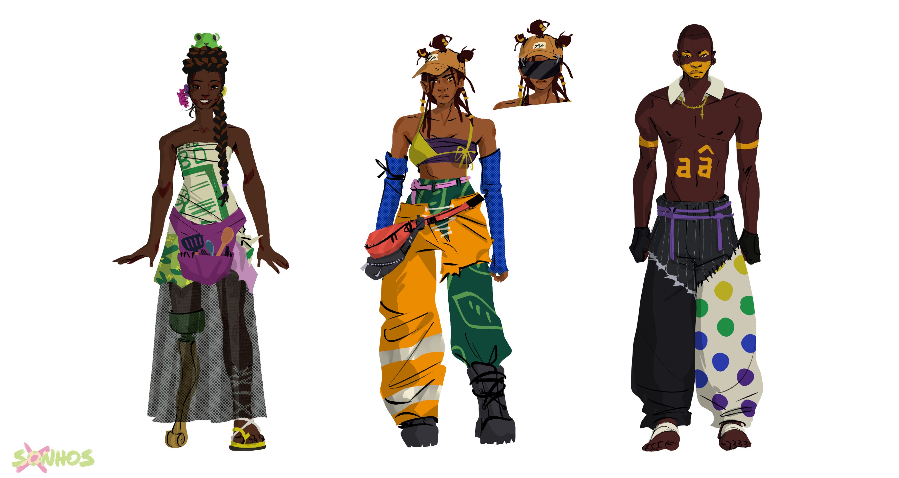
The Characters
As mentioned in the previous issue, an extensive research of fashion was made to guide the designs. The main design principle used for this was “patched up rests”, making clothes out of old pieces of things, aside from including references to Rio de Janeiro.
Tapioca
The protagonist. From the beginning it was clear that she would be a motorcycle user, since that makes for a cool, dynamic chase sequence. Later, I decided the reason for her to own a bike was that her function in this post-apocalipse community was to deliver mate to everyone. Mate (sodas mostly) is a very popular drink in Rio, and most cariocas have an affectionate memory of the mate-vendors at the beach. She is somewhat cynical, believing that the world is already dead and all this is just a delirium. She keeps herself around optimists to not drown in her own pessimism, which is why Kellen is her closest friend. Her pants are from the uniform of “Garis”, Rio’s street sweepers.

Kellen
Kellen’s role in the story is to be the light at the end of the climax, the relief after the chase, and to embody whatever joy one can have in a destroyed world. That is why she has a toy in her hair and cooks delicious things for her friends. Cooking can be an act of love, joy, patience, and even excess in a scarce world, so her bright personality is communicated through her dedication to making good food. The choice to give her a prosthetic leg came as tribute to Furiosa from Mad Max and symbol of her refusing to be victimized by the world. The upper part of her dress is a “canga” with the logo of a famous Brazilian snack, Biscoito Globo.

Técnico Dedê
Técnico is the word used for soccer coaches, and the word chosen by the group of the Agraciados to name their leader. This character is there to bring balance to the chaos, counter balancing the wild antagonists. He helps the protagonist but also scolds her. He’s the responsible adult, but not a mentor. The aesthetic for him and his group is inspired by the people who juggle at traffic lights for some change. They sometimes dress up as clowns or simply paint their face, and encountering them in my daily life has left a strong impression, so I chose to indirectly feature them in this world.

Caolheirox
The group of the antagonists is called Caolheirox, which is a mashed-up term by me for “people who make you one-eyed”. They got their name because they believe they can squeeze Guaraná - a famous soda drink - out of people’s eyes if it’s the right color. This crazy desire for the extinct drink makes them an unpredictable and dangerous group. They are the most inspired by the madness in Mad Max. They have a leader couple, Theus and Maré, which drive in the prestigious pink limousine, inspired by a party car sometimes spotted in Rio.

The vehicles
Being a direct reference to Mad Max, there had to be pompous vehicles. I applied a similar logic to the character designs, using scraps to put together something, and aside from Mad Max the Burning Man festival had great references for that. The pieces used for the cars are specific references to Rio, like the taxis, the “Fusquinha” (Beetle car), the above mentioned limousine and the excavator being painted after the “Boitatá”, which is a Brazilian legend about a burning snake.

Missing the deadline
Within the framework of a semester, we have specific deadlines for check-ins on the project. My original goal was to have all the concept art for the first check-in, but due to a health issue I couldn’t work for a week. That seems like not a lot of time, but it was the precise timeframe I had planned to make the concept art for the environments in. I lost that time - and didn’t deliver environments. And then I had to keep going because of the tight deadlines, I had to do the animatic after all and I decided to sacrifice the rest of the concept art in that moment. I decided it would be more crucial in the layout stage, when detailed backgrounds would be created, and that I could create rough background designs in the storyboard stage. I do not like having to do this, and I believe I could have had stronger designs if the concepts were sketches out before, but that’s what happened and it worked out fine.
But even with that little hick-up, the character creation stage was so fun! Every sketch energized me for the next and I attribute that to having chose a fun style to work in and all the research that went into the details of the designs. The designs also really help to excite others about the project and motivated me immensely for the storyboards.
Up next
The storyboard and animatic! One of my favorite parts of the project, so I can’t wait to get into drawing quickly, looking for voice actors and making a rough sound-scape.
This is awesome ahhh!!