


The glamorous pre-production
Rushing through more concepts and dealing with 3D

Log
Project SONHOS
Time in production 36 weeks and 6 days
Status Production (rough animation)
Today I will share the bits of art that needed to be created before I could just jump into animating, the things that also belong into pre-production. They may be less impressive than the storyboard, but not less impactful for production. And again, I have a little snippet from a guest!
Style frame
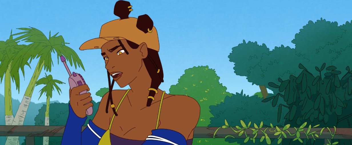
I did a style frame to see for the first time myself how a finished frame of the animation could look like - and to communicate the same to people around me. I already knew I would use a “simple” style, which means no-variation line art and flat colors, so drawing the frames themselves wouldn’t be too elaborate. This allows me to focus on drawing the semi-realistic characters well. I did this before doing the character sheets, so the character is slightly off model.
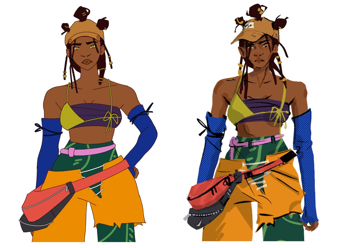
Model sheets
The purpose of a model (character) sheet, is, as the name states very obviously, to keep the character on model, which simply means looking consistent. First, I thought that was only a relevant concern in a production involving multiple artists, but I discovered that I myself need the sheet for reference, since I have not drawn the characters for this project often enough to be used to drawing them in correct proportion yet - and proportion is the main thing I pay attention to, as it is the main thing distinguishing those stylized characters from each other. In the case of this project, the creation of the model sheets was also the first drawing of the characters in the style they would be animated in, which means it was the first translation from the original concept art. While doing the model sheets I was deciding which details to cut, how to simplify patterns and which details would have to be drawn on different layers for animation purposes.
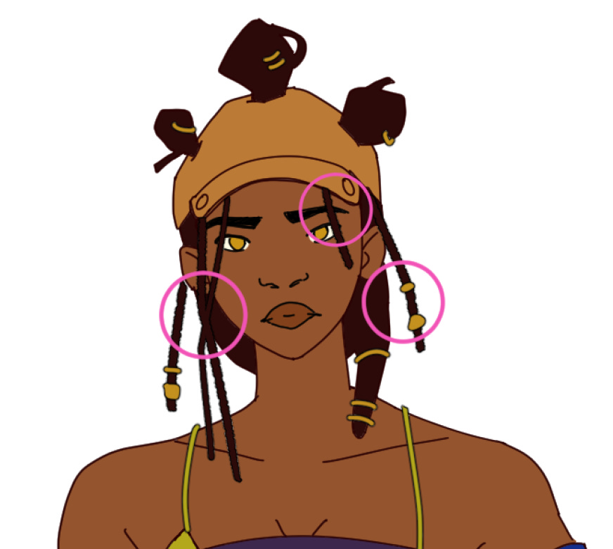
I drew model sheets for 4 characters before starting the rough animation process - Tapioca, Kellen, Técnico and Maré. I still had to do one for Theus, but the timeline made me rush forward a bit. Later, when doing Theus’s rough animation, I felt the impact of the missing model sheet. I was guessing how he looks, instead of referencing.
Color script
I have seen color scripts for other movies made with much more detail, but for my purposes I didn’t feel the need for that. I assembled some key shots from each arc of the story into one big board, and just sketched colors in on top. Those blobs are enough for me to define a color palette with 2-3 main colors, and since the style I chose is pretty flat in terms of lighting, I didn’t need to lay out the colors in an accurate way. (If this was 3D, this color script would need to communicate to the lighting artists how to light the scene, and therefore be more refined.) Realistically, when I actually color the backgrounds in, the colors will shift slightly to work in the composition.
I love the process of coloring in art in general, so this step is very enjoyable to me.
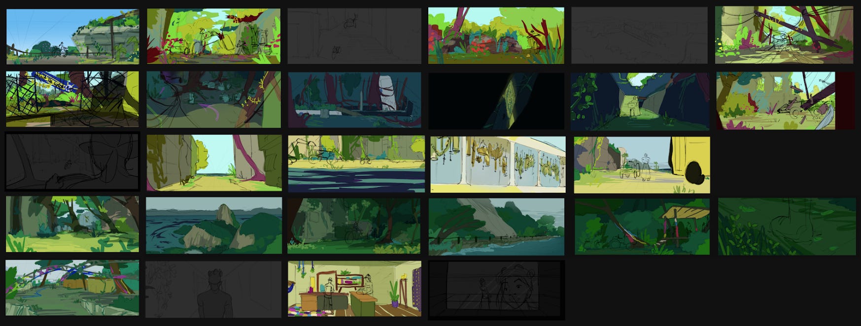
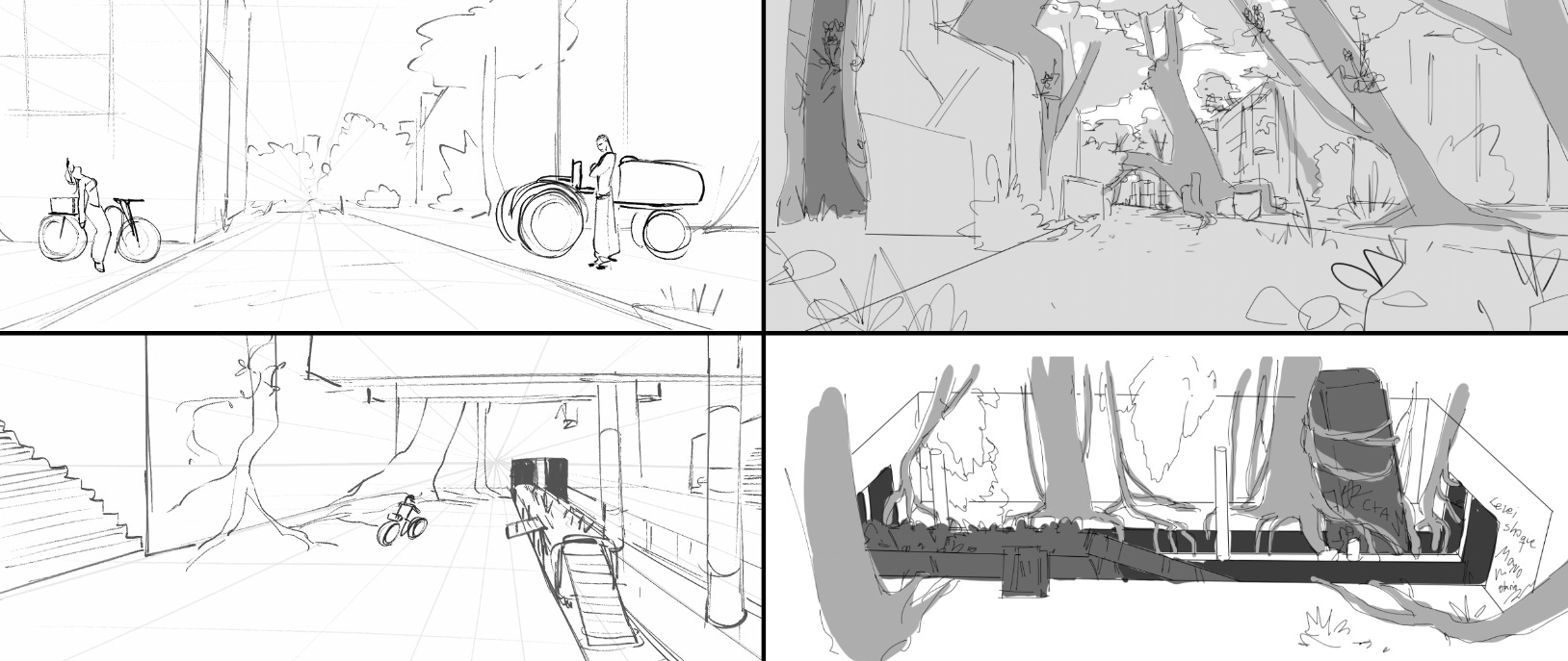
Environment sketches
It was my intention to make concept art of the environments before getting to storyboard, but I got delayed and had to finish the animatic faster. That means that in the boards, the environments are generic. So I decided to go back and refine some of the background sketches over what was already done, trying to incorporate more specificity and intentional design. Because of time, I only did that with key backgrounds, the ones I deemed more significant in communicating the world and having an impact in the scene.
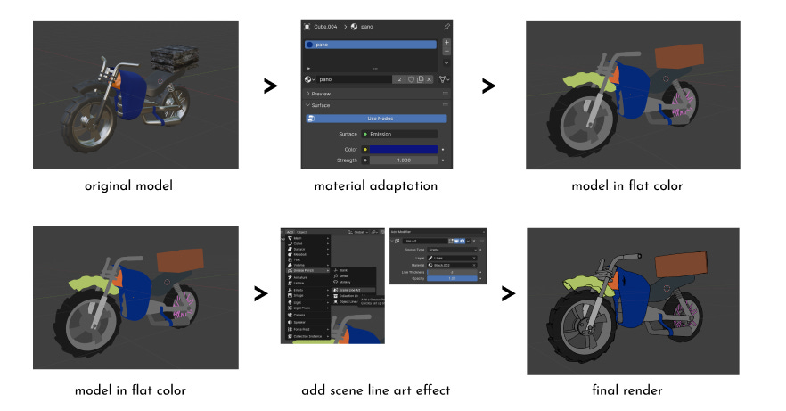
3D models
Since I am unreasonable, I created a story that involves multiples vehicles in a chase sequence. When I got to reflect about how I would animate that, I came to the conclusion that I should use 3D models as a base, even if just to trace over. In the beginning, I did not know which process I would follow for this, but I started by finding someone who knows how to model in Blender, Gabriel Borja, to collaborate with me.
“In our collaboration, we dived into a fascinating cycle of transformation, where 2D art was the base for 3D models, which then returned to the 2D plane and aesthetic. This back and forth of 2D and 3D is somewhat pretty philosophical about the nature of art and creativity. I did not have previous experience with this kind of interaction, which I think enrichened the creation process.”
As he mentions, I discovered a way to make the 3D models look 2D, thanks to Blender’s grease pencil tool. That means instead of just using the models for reference, I could incorporate the renders directly into the animation, saving myself a lot of time. Being completely honest, I don’t love being able to recognize a 3D asset in the middle of a 2D film, so I tried to chop up the smooth movement from 3D animation to make it feel less 3D. There’s still something that reveals the 3D though, and in the future I want to understand more about why that is.
Even with the 3D models, I started looking at my shots and questioning if I could simplify the vehicle parts - showing less of them or make them move less. I realized here how budget (production time) actually influences shot choices, in a very direct way. Throughout the project, every limitation time put on the production made me remember the phrase “The medium is the message” and how accurate that is. I recommend this post by Animation Obssessive to understand more around that.
Also, dealing with the animation of the vehicles gave me a whole new appreciation of Akira.
Up next
Next issue I will finally talk about animation! About doing the roughs, how I’m using the software CSP, incorporating the 3D, worrying about clean up and reaching out to people once again.
Have a magical day!